


The legendary packaging of Lyle’s Golden Syrup is being replaced on plastic bottles to depict a smiling lion face and a single bee.
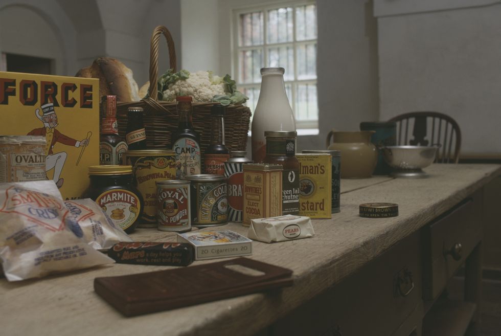
Lyle’s original tins held the Guinness World Record as the world’s oldest example of brand packaging.
The logo of the brand has traditionally contained imagery of a dead lion swarmed by bees, but the design has now been axed for a less macabre illustration.
Since its launch in 1881, Lyle’s Golden Syrup has been marketed with green and gold packaging accompanied by the biblical quote “Out of the strong came forth sweetness”.
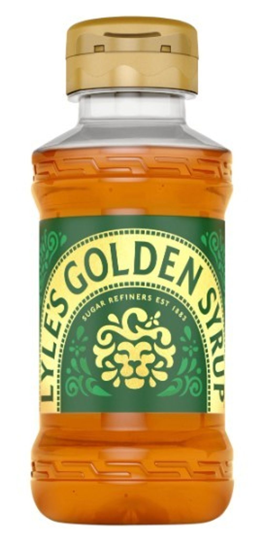
The new packaging will feature a friendly-looking lion
|LYLES
The quote alludes to the tale of Samson in the Book of Judges, which tells the story of a Lion killed by Samson’s bare hands.
When the character returns to the carcass days after the kill, he finds a hive of bees in the beast’s body.
This hive goes on to provide enough honey for Samson to feed his family, despite them not knowing where it originated from.
Although the colours of the packaging will remain virtually unchanged, fans appear confused about the rebrand.
The symbolism of the original packaging evaded many consumers who shared their remarks on X.
“I thought the lion was asleep?” wrote one user, while another quipped: “First time I noticed this lol.”
Critics of the rebrand include Dan Barker, who described it as a “rare example where they’ve kept the elements from the original (a dead lion, being eaten by bees), yet still made it worse”.
Robert Bargery, executive director of the Royal Fine Art Commission Trust, told MailOnline: “A successful brand with a solid reputation has more to lose than ageing by going for a new logo.
LATEST DEVELOPMENTS
The purpose of the rebrand is to garner greater appeal
|GETTY
“The redrawn lion is so stylised as to lack clarity at first glance, whereas the old lion is clearly a lion: it is what it looks like on the tin.
“But who knows? Golden Syrup may soon be as stigmatised as cigarettes, so the lively re-brand of a dead lion may excite a sugar rush among the avocado-on-toast generations.”
The founder of the brand, Abram Lyle, is believed to have drawn inspiration from his faith when choosing the original packaging.
GB News has contacted Lyle’s Golden Syrup for comment.