Britons left 'disgusted' as building society scraps Robin Hood from logo over 'inclusivity': 'We should fly the flag for Nottingham'
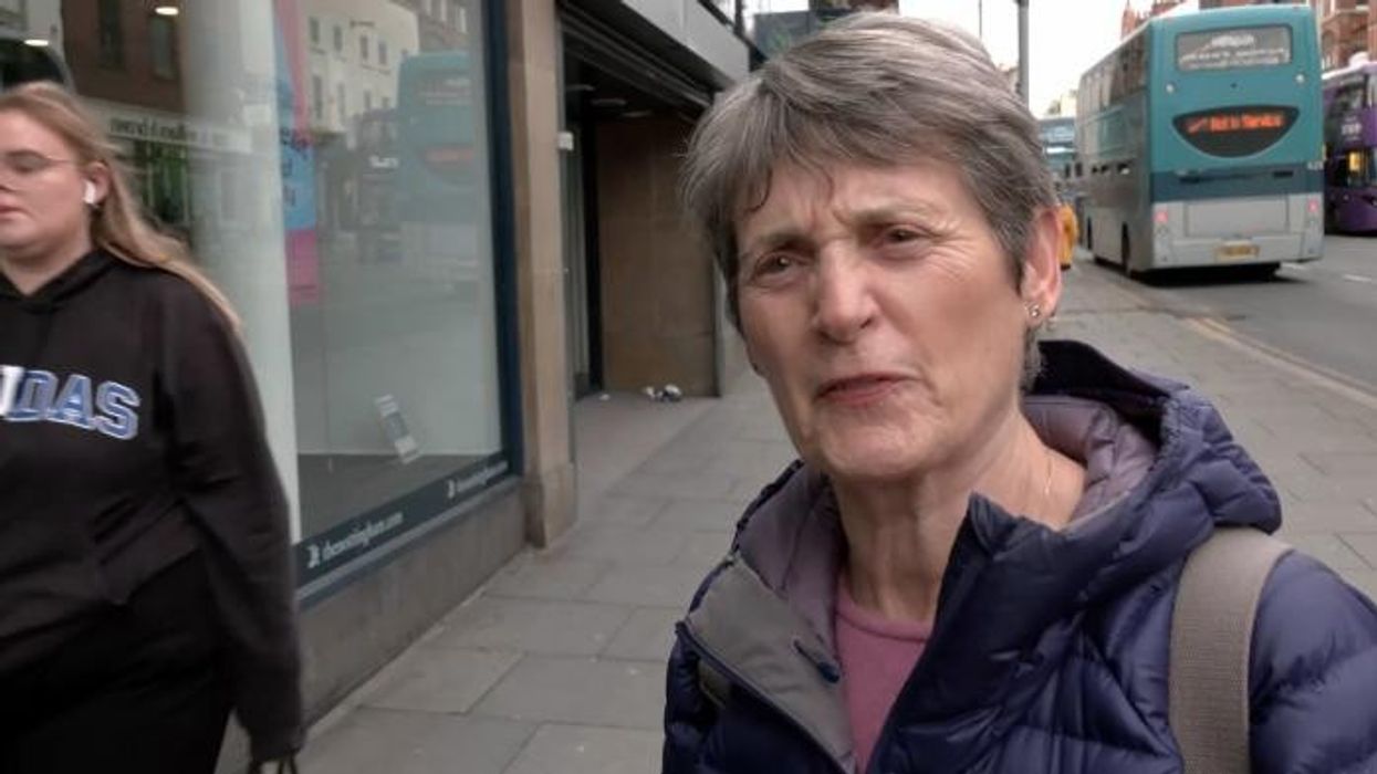
WATCH NOW: Nottingham residents deliver their verdict on key change to building society's logo
|GB News

The Nottingham Building Society claimed the logo needed a 'glow-up' and reflects the 'financial diversity' of Britain today
Don't Miss
Most Read
Latest
Residents of Nottingham have expressed their outrage as one of their key building societies has ditched the iconic Robin Hood from their logo, in a bid to be "more inclusive".
The Nottingham Building Society announced the change on their website, citing "financial diversity" and the need for a "glow-up" as the reason for the move.
Scrapping their logo featuring Nottingham icon Robin Hood, introduced in the 1980s, the building society now boasts a simpler, more modern logo, featuring a single cursive 'N' on a neon green background.
A spokesperson claimed: "Our new brand reflects our commitment to building for the future, for both our customers in Nottingham and those right across the UK."
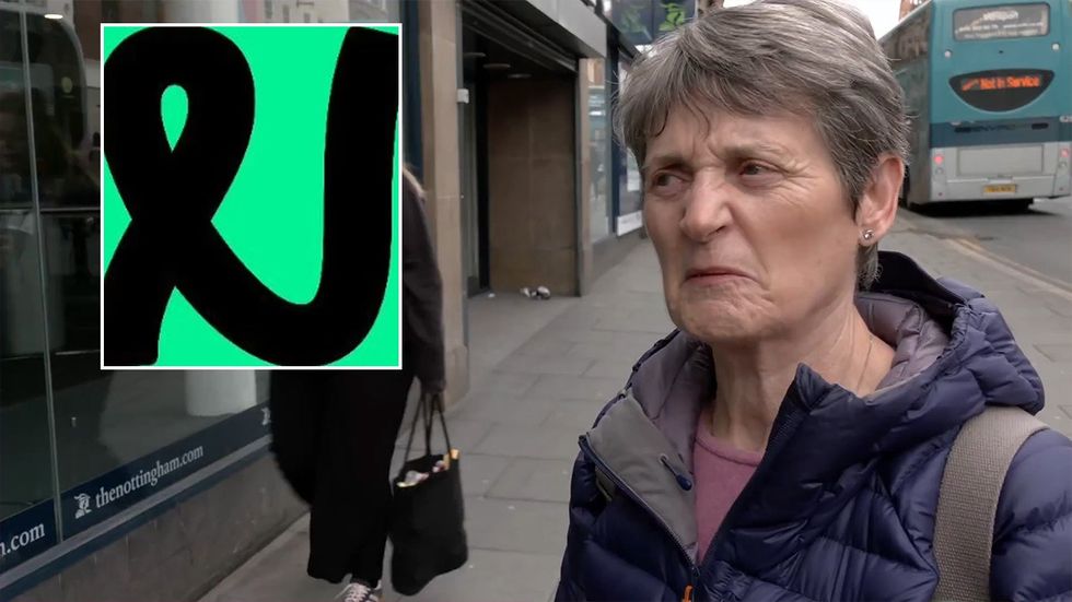
Nottingham residents expressed their outrage at the new modern logo, without the city's iconic character
|GB News / The Nottingham
Reacting to the logo change, residents of Nottingham spoke to GB News reporter Will Hollis and delivered their verdict on the decision.
One local admitted: "I think I'd prefer to keep it, actually. Because Nottingham's noted for Robin Hood, isn't it?
"So I think it's nice to keep some things without change, for a change."
Echoing the thoughts of the first resident, another lady told GB News that she is "disappointed" in the building society for ditching the logo which "represents Nottingham".
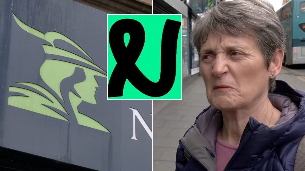
Nottingham residents expressed their outrage at the new modern logo, without the city's iconic character
|GB News / The Nottingham
She said: "I think it's very sad actually, because we should fly the flag for Nottingham and for Robin Hood, it's very important."
LATEST DEVELOPMENTS:
When told the reason for the change, to enable the company to be "more inclusive", she scoffed, adding: "It makes no difference! It's too right on.
"If you've got a logo and it's a good logo, keep it."
One Briton was left particularly outraged by the decision, claiming he is "disgusted" in the building society.
He fumed: "I'm absolutely disgusted about it. Nottingham is all about Robin Hood.
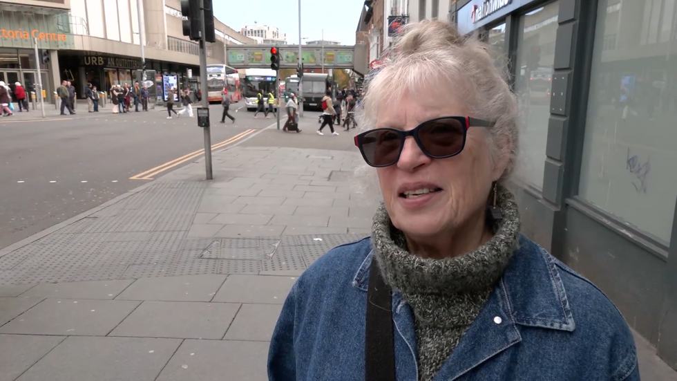
Nottingham residents delivered their verdict on the change to the logo
|GB News
"We've already had Nottingham City Council give up on the tales of Robin Hood, because they don't want to know about the guy. It's just amazing that this is another thing now. I'm absolutely disgusted."
In further defence of the logo change, The Nottingham stated on their website: "We've mixed our rich history with a modern twist. We want to reflect society as it is today.
"For us, that means championing inclusivity and celebrating financial diversity. Consider it a glow-up, but for a building society, changing to make sure we're fresh and relevant for current and future members.
"Your financial needs and personal circumstances are ever-evolving. Your money goals are one of a kind. You're saving for different things, earning money in different ways, and life might not be 9-5 anymore."


